B2C Website Redesign
Lead designer, consumer web experience.
Silver Stevie® Award-winning redesign.
60 Core Brand Pages ~ Scalable Franchisee Site System ~ 1.5 Year Timeline
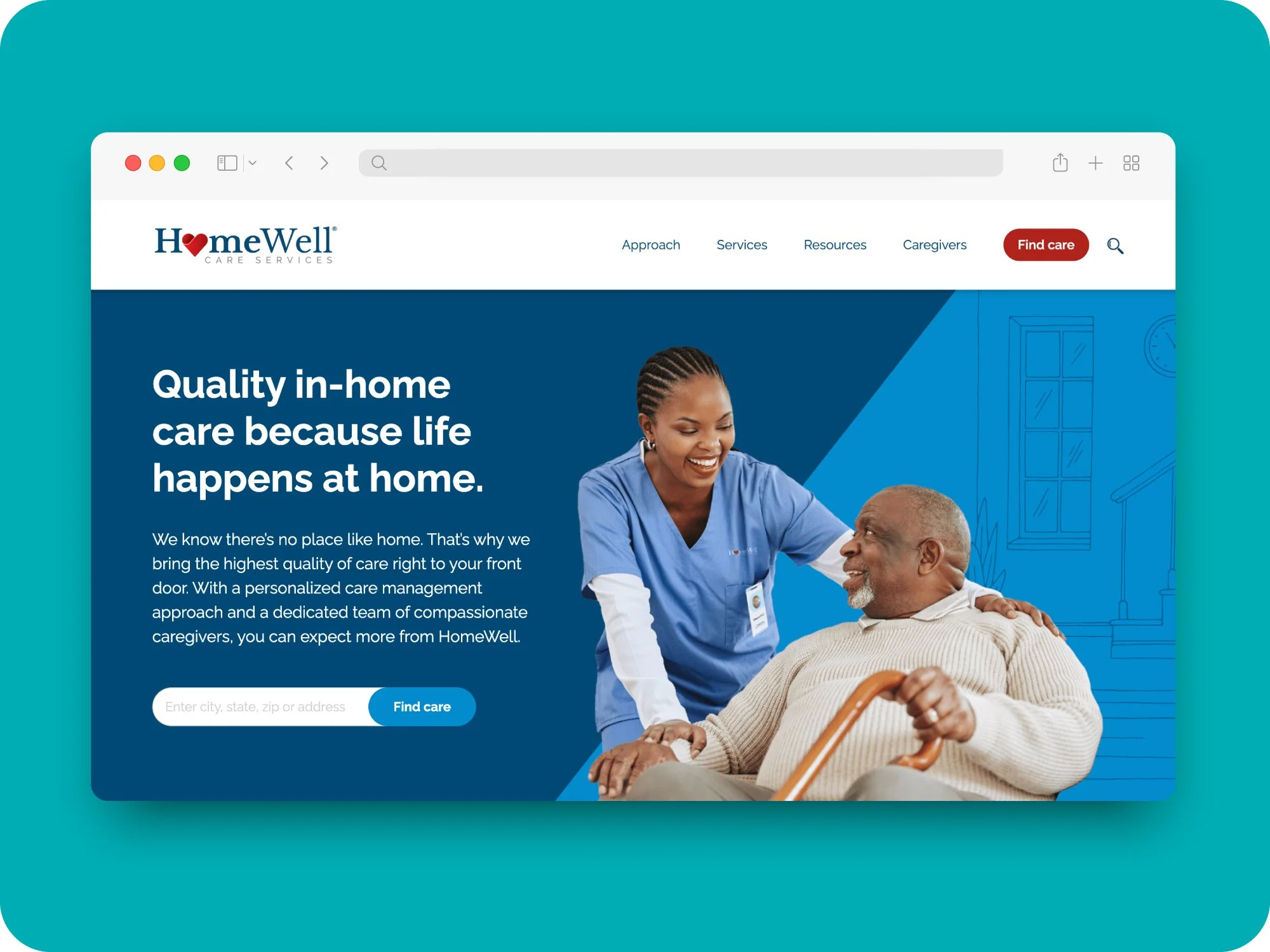
The HomeWell B2C website is a WordPress-based redesign of the brand's consumer-facing site. I led the look, feel, and page structure design, and built every page myself using Avada, while our developer and outside agency handled deeper backend development.
The Problem
A growing brand, outgrowing its website
HomeWell was growing quickly, but its consumer website wasn’t keeping up. The site felt dated and text-heavy, and no longer reflected where the brand was headed or the needs of a franchise network spanning more than 70 agencies and 100+ U.S. territories.
We needed to rethink the experience — modernizing the look and feel, making it easier for people to find care and connect with a local agency, and creating a system that could support individual franchise locations without losing consistency across the brand.
I led the redesign, shaping the experience and design system from the corporate site through the local agency pages.
70+
Franchise agencies to support
100+
U.S. territories
Process
From design to front-end build
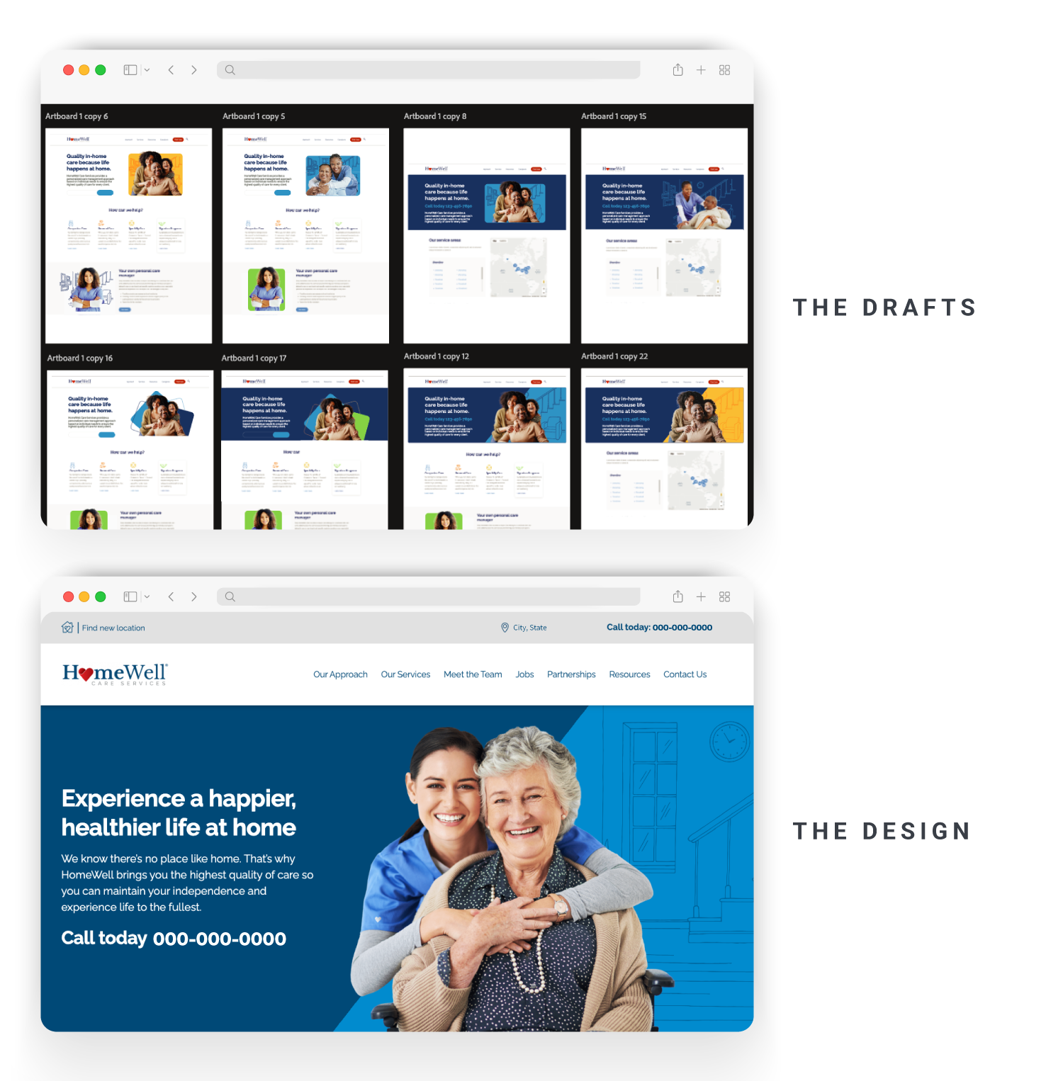
I led the day-to-day design and front-end execution of the project, taking the site from page concepts through build, QA, and launch. I worked closely with our developer, external WordPress partner, and SVP of Marketing throughout the process, stepping in across design, implementation, and problem-solving as needed.
- Designed the full page experience in Adobe XD, including layouts and responsive behavior across the site
- Built the majority of pages in Avada on WordPress, partnering with developers when work required deeper backend development
- Troubleshot front-end issues and refined solutions when the platform’s default behavior didn’t support the experience we were trying to create
- Led QA and helped coordinate the day-to-day workflow throughout the 1.5-year project, helping keep cross-functional work moving from design through launch
Building for Scale
A system for launching new franchisee sites
As HomeWell's franchise network grew, we needed a faster way to launch new location sites without rebuilding the experience from scratch each time.
I created a modular base template that included the full set of content modules a franchise location might need, then paired it with a structured intake process to capture services, licensing details, imagery, and other location-specific content.
That gave our developer a clear blueprint for what to customize for each launch while keeping the overall experience consistent — turning what could have been a one-off build for every location into a repeatable, scalable process.
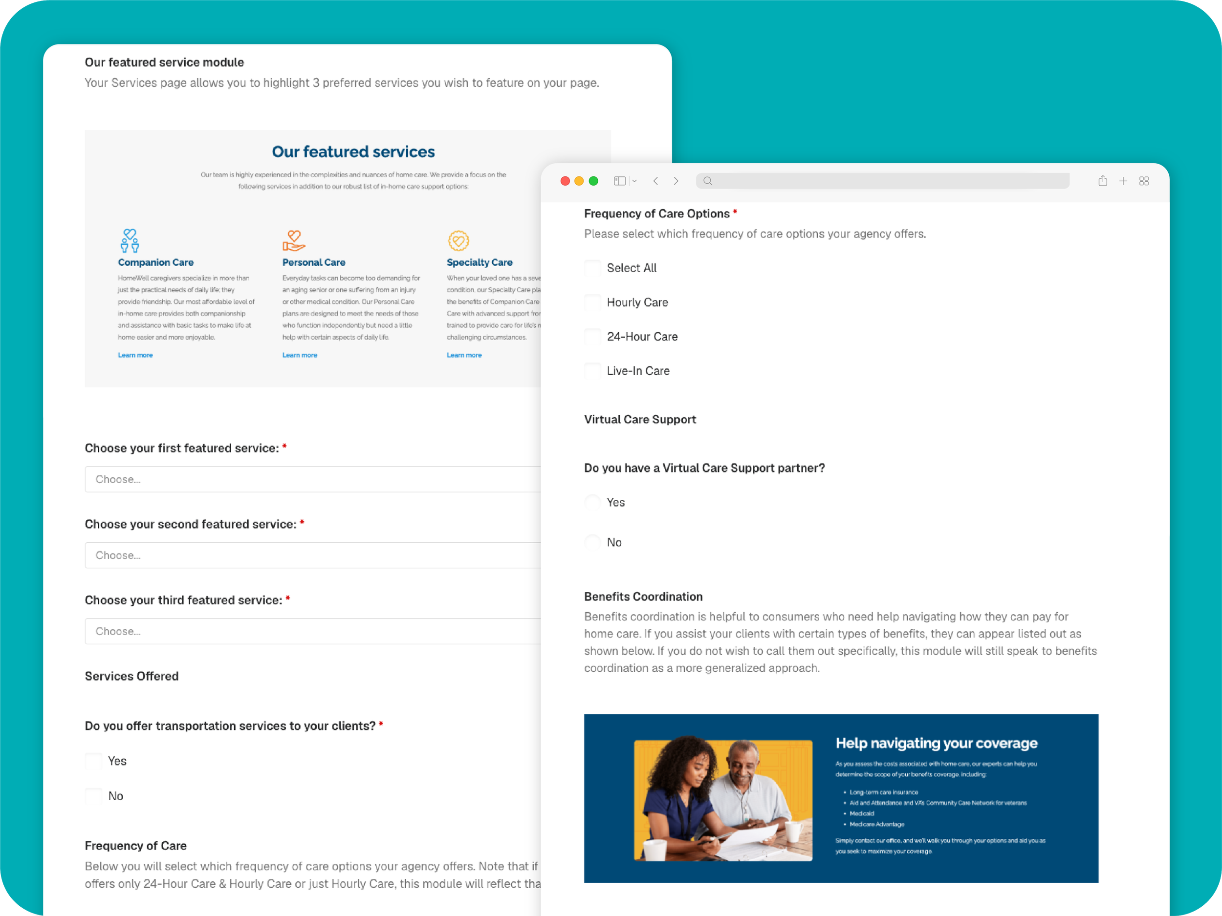
Intake Form
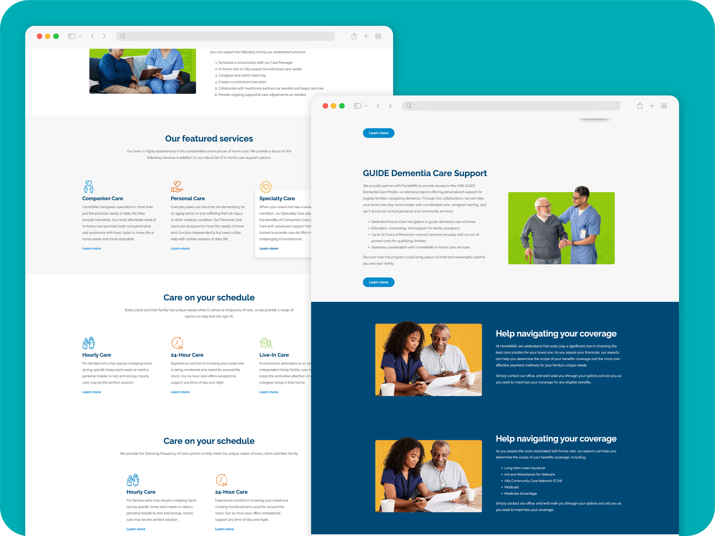
Base Template
Research & Discovery
Testing with franchisees before finalizing the build
Before the franchise sites were finalized, I created simplified interactive prototypes in Adobe XD and shared them directly with franchisees for feedback. By removing most of the visual polish, I could keep the conversation focused on structure, navigation, and how the experience actually worked.
I collected and organized the feedback to look for patterns, which surfaced a recurring usability issue in the franchise navigation. The utility bar and main navigation were competing with each other, making it less clear what information belonged to the local agency versus the broader HomeWell brand.
Based on that feedback, I redesigned the hierarchy around what mattered most to visitors: the local agency’s phone number and location became more prominent, while the path back to the main HomeWell site was reduced to a quieter secondary action.
I worked through the findings with our SVP of Marketing, and together we refined the approach before moving the updated navigation into the final build.
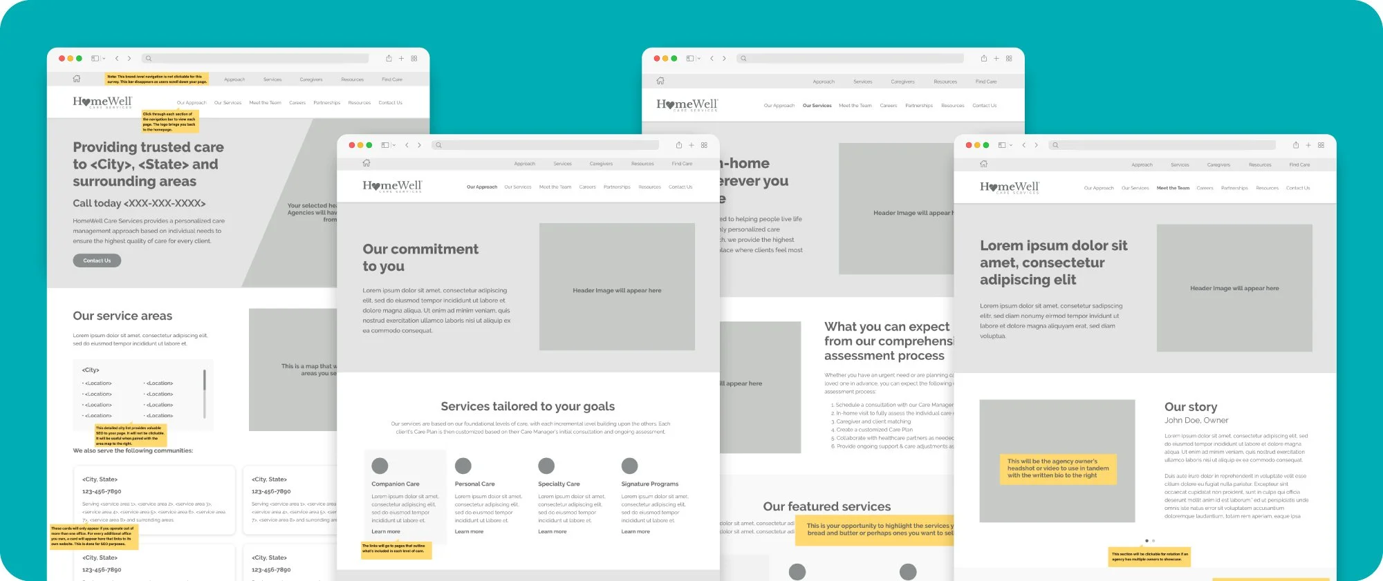
Simplified after franchisee feedback
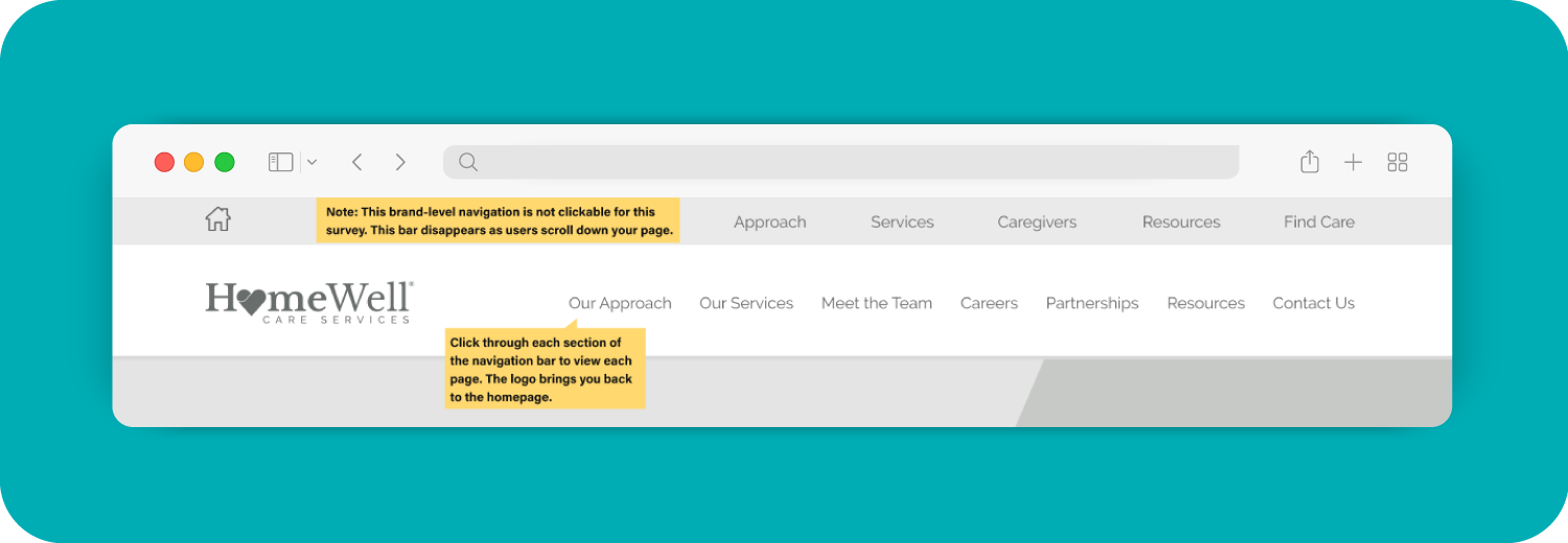
Before — duplicated the franchisee nav below it
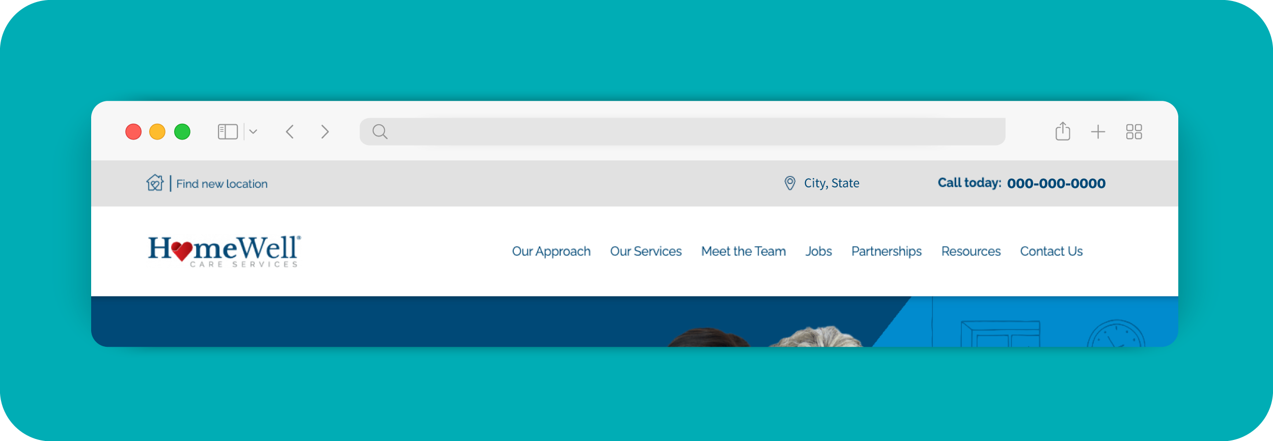
After — streamlined to essentials only
Visual Execution
Bringing the redesign to life
A look at how I evolved key pages across the brand site, franchisee template, and shared tools like the location finder.
Brand Site Homepage

Redesigned a dense, text-heavy layout into a scannable hero and icon-driven service overview.
Franchisee Site Homepage

Extended the brand site's design system into a scalable franchisee template, used to launch every new location's site quickly and consistently.
Location Finder

Designed the map interface and interaction states — including the location list panel, pin styling, and click behavior — replacing a static map graphic with an interactive experience.
Blog

Shifted the blog's visual direction from stock photography to custom illustration for a warmer, more distinct brand voice.
More pages from the site
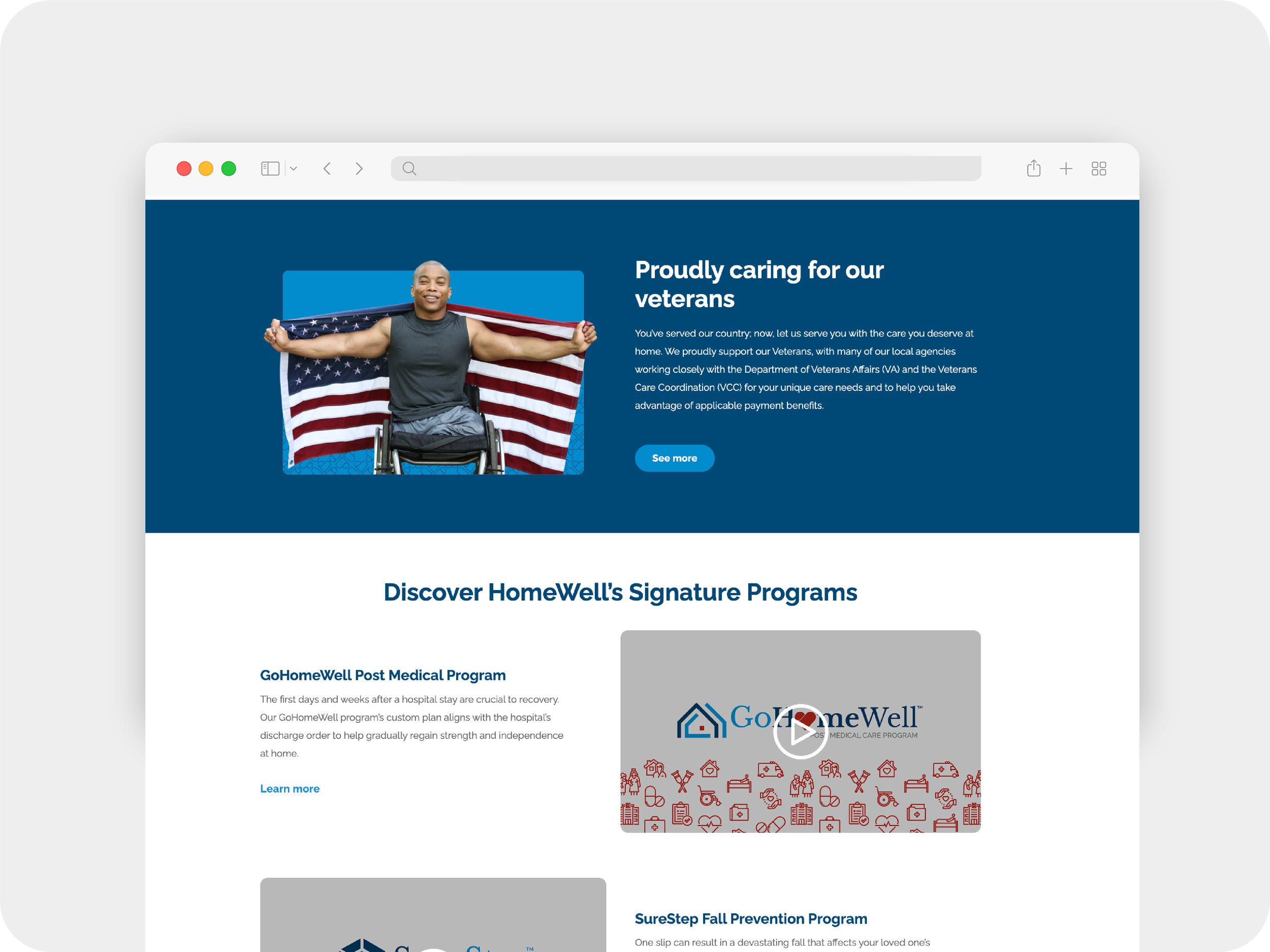
Section of Our Services Page

Front Porch Blog
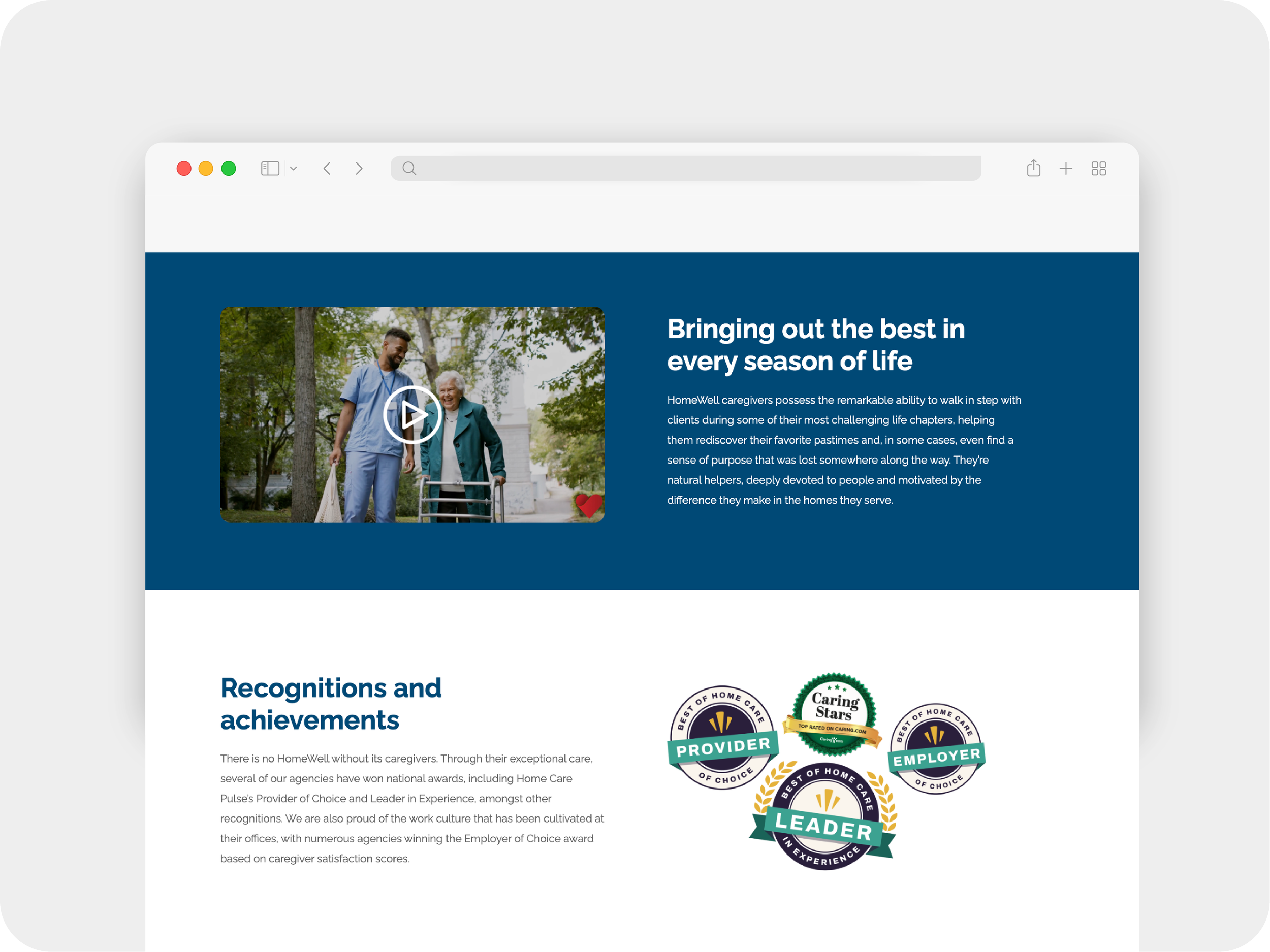
Section of Caregiver Page
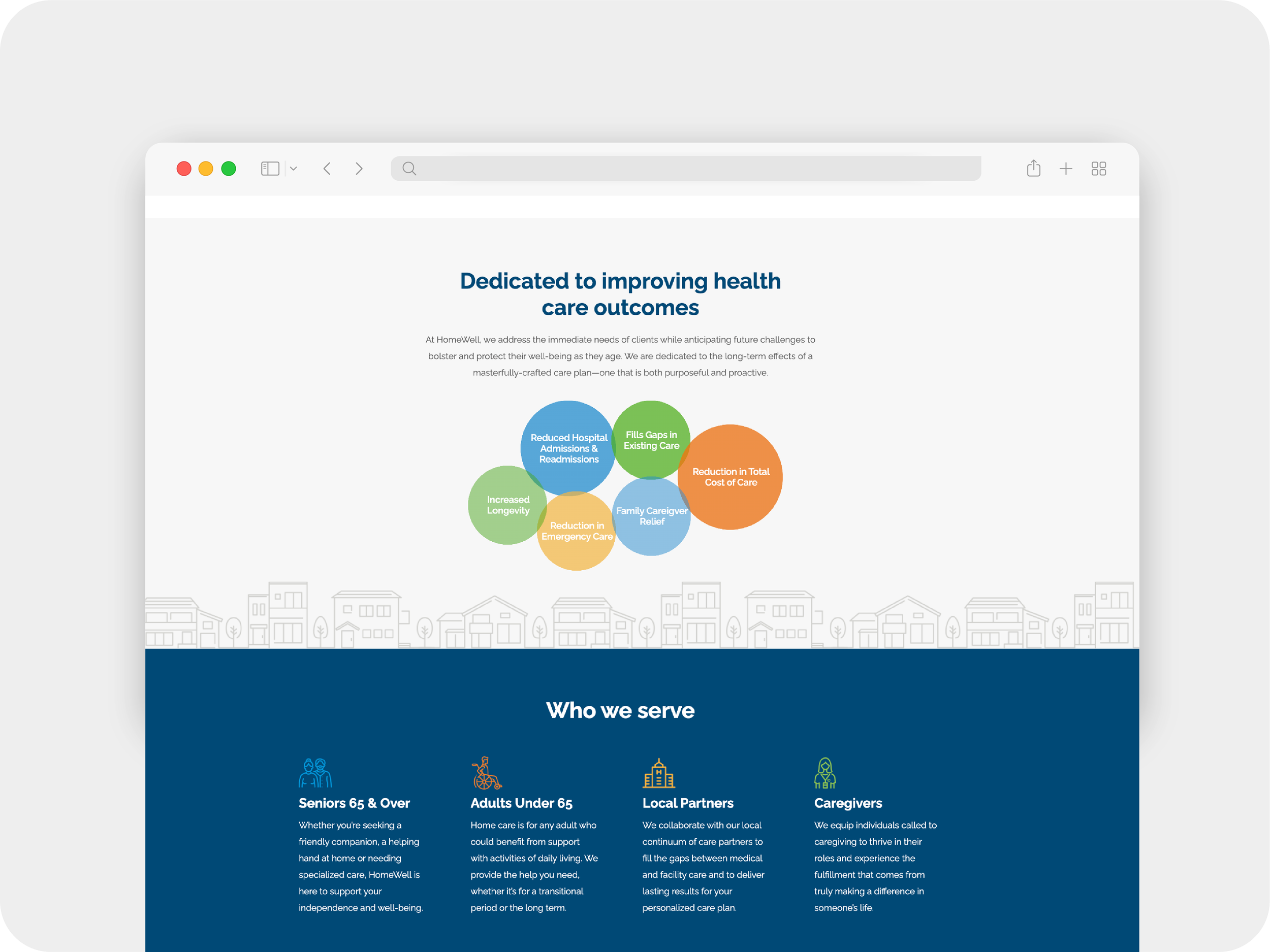
Section of Our Approach
Collaboration & Workflow
A small, cross-functional team
While I led the design and front-end build, the redesign was a collaborative effort. Our SVP of Marketing directed the project and brand strategy, our copywriter shaped the site’s voice, and our Digital Marketing Manager supported backend implementation. For deeper development needs, we partnered with an outside agency on the site’s underlying architecture.
Project Coordination
Kept the day-to-day workflow organized across design, development, and review, helping track priorities, open items, and next steps throughout the project.
Issue Tracking
Helped maintain the bug and development request log, keeping issues organized and visible across the internal team and development partner.
Weekly Calls
Helped keep our outside agency aligned on priorities, open issues, and next steps.
Outcome
A stronger digital foundation for a growing network
The redesign gave HomeWell a more modern, scalable web experience that better supported both the national brand and its growing network of franchise locations. The new system created a clearer path for consumers, a more consistent experience across local sites, and a stronger foundation for future growth.
Award-Winning Design
Silver Stevie® Award
Health Products & Services
Judges recognized the site’s educational resources, improved user experience, and human-centered design — including how well it served audiences ranging from care recipients and decision-makers to caregivers and referral partners.
Franchisee feedback helped shape the final experience through prototype testing and review, helping ensure the system reflected the needs of local agencies.